Role
UX/UI Designer, Copywriter
Tools
Figma, Miro, FigJam
Timeline
6 Weeks
Background
Total Wellness+ started from Austin’s desire to help educate people about the benefits of pairing functional medicine with a healthy lifestyle. During Covid, the world saw an increase in consumers’ comfort level with online shopping. This allowed Austin to launch his idea through an online e-commerce website that would pair those seeking to address their health needs with his team of health professionals.
Identifying an opportunity for Total Wellness+
Problem
As we began, Austin’s desired user behavior was clear. “So ideally, everyone who ends up on our website is scheduling a consultation”. He explained a two-dimensional lead-generating model:
1. Scheduling a virtual consultation with a health expert
2. Completing a Health and Lifestyle questionnaire .
The landing page should promote lead generation
Solution
A page that seamlessly highlights the valuable benefits of the products and programs offered by Total Wellness+ in a trustworthy design will allow users to more easily sign-up for consultations and complete the Health and Lifestyle questionnaire.
Designing for value, trust, and aesthetic
UX Process
Capitalizing on Lean UX methodologies for a quick MVP turnaround
Our team took continuous feedback primarily from our stakeholder to generate data on each iteration of our work. This allowed the team to quickly make decisions about our product scope, direction, and ultimate viability.
User Personas
Interviewing our main stakeholder, Austin, to learn more about his customers, it quickly became clear Total Wellness+’s target users included customers from all health backgrounds
To ensure our design was accessible to Total Wellness+’s wide variety of audiences, we created user personas around two archetypes.
Competitive Analysis
Studying other lifestyle brands reinforced the importance aesthetics in a world of changing trends.
With the stakeholder preferring updates to his UI, we approached each brand with an analysis of their visual heuristics. Adopting these trends would allow our users to more easily sign-up for consultations and complete the Health and Lifestyle questionnaire on our wellness website.
Design
We chose the background colors based off of our stakeholder’s preferences and brand identity.
Green represents the brand’s clean lifestyle identity while blue imbues a sense of professionalism, brand legitimacy, and trustworthiness.
Sketching
Each team member zeroed in on a different aspect of the website during our sketching exercise
We conducted a round of Crazy Eights, diverging the design process into a variety of focus on different parts of the website. Some focused on the hero header while others focused on consultation scheduling and product images.
Wireframes and Copywriting
Stakeholder feedback helped keep our designs and copywriting focused on increasing consultation sign-ups, highlighting the individualized plan offering, and showcasing the Total Wellness+ brand.
After each team member independently designed a low-fidelity wireframe landing page, we met with our stakeholder to discuss which aspects of our different designs would best solve our different project goals.
Final Screens
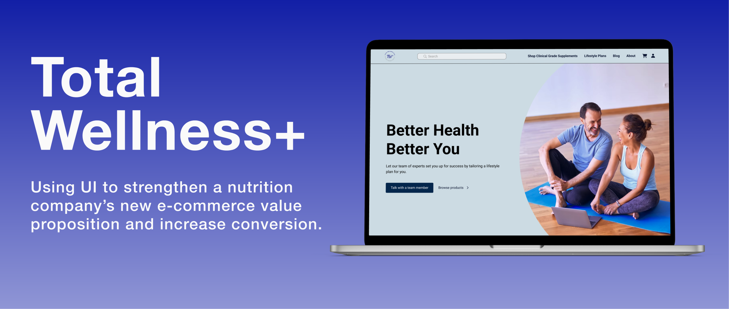
Our final screens demonstrated improvement in showcasing our brand attributes.
Using our stakeholder’s feedback, we began designing our high fidelity landing page. We completed three iterations, refining each to ensure the page met the company’s goals, each parading the new face of the Total Wellness+ brand.
Our imagery speaks to both of our user personas, catering to a wider audience than the previous site.
Our stakeholder emphasized achieving an emotional connection in our writing, giving us a personalized direction to headlines
We designed to convey our stakeholder’s 3 main points
• Who we serve
• What we do
• Why we’re the best option
Prototype
After altering our design using stakeholder feedback, we reached our final prototype
Interact with the final prototype here!
Conclusion
Final conclusions and takeaways
1. Our client opted for self-directed feedback to the design during our project rather than robust user testing. After hand-off, Total Wellness+ will continue to improve on our designs by conducting user testing, which I believe will provide valuable feedback concerning the effectiveness of our redesign, which can be used to continually improve the site in the future.
2. Overall, I felt like I learned a lot about the flexibility in approaching a product redesign by following the direction of our design lead. I would have preferred to have altered our UX method slightly, opting for independent sketching exercises rather than our crazy 8s, which helped me discover some of my own preferences in certain design approaches.
3. This was my first time working on a project with so many designers, and I was happy to find that even in a group with a huge overlap in skill, we were able to quickly determine our own roles and collaborate, using our design skills together with very few occasions of ever stepping on each-others toes. And a newfound appreciation for FigJam! 😁


