Timeline
6 Weeks
Role
Figma
Tools
UX Designer
Background
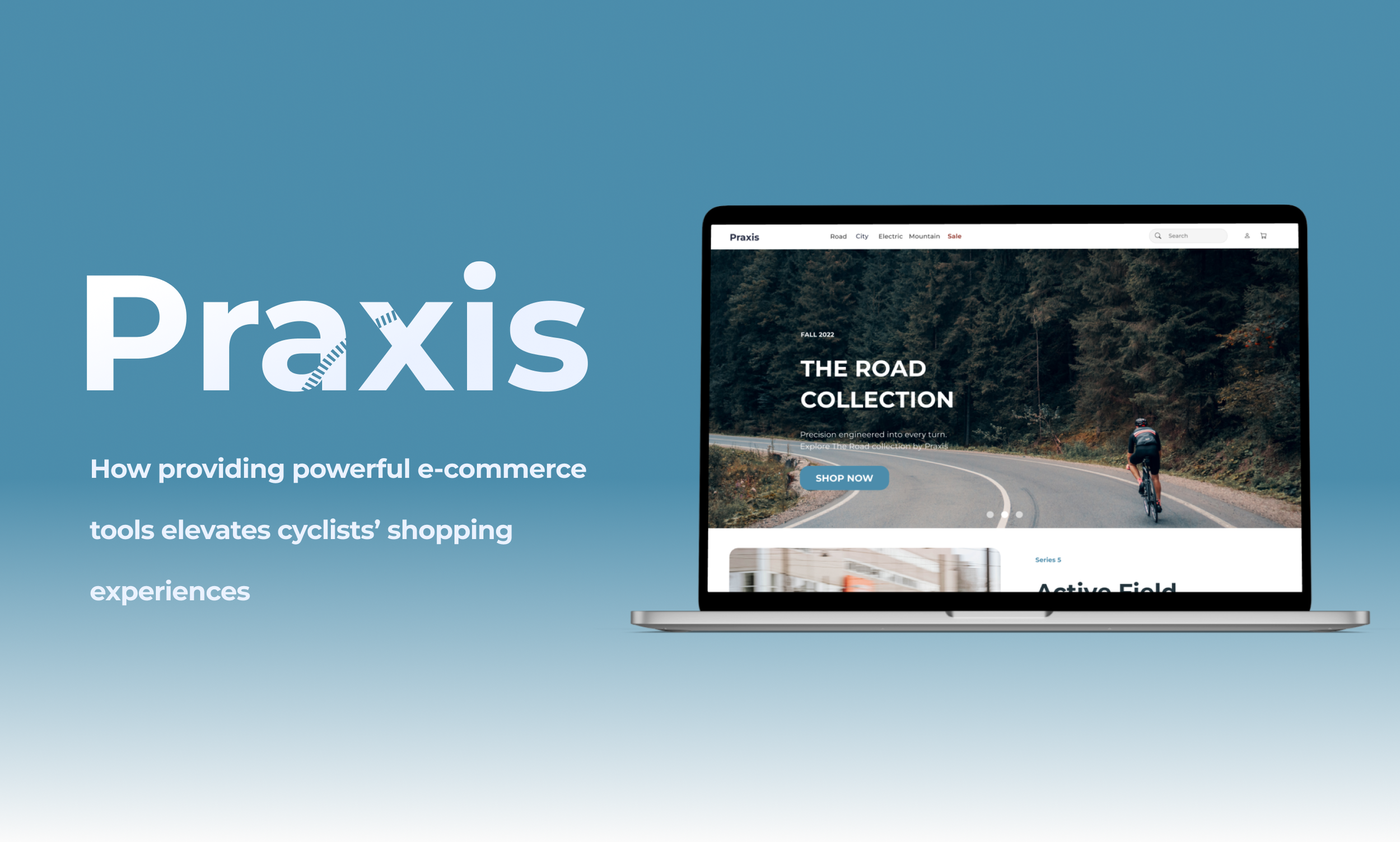
This UX study was completed as an academic project based on a bicycle company which has found an underlying problems in its e-commerce shopping experience. According to research data, 50% of users abandon the site after averaging 7 product page visits due to the site’s failure to highlight the difference between their products.
Problem
Cyclists on Praxis.com are unable to determine the best bicycle to purchase.
Solution
Accentuate Best Seller and Product Comparisons features.
My UX Process
Cyclists are experts at comparing products, making them ideal candidates for e-commerce comparison features.
Research data revealed cyclists are more selective than the average customer. It was clear I would need to formulate a robust understanding of e-commerce tools such as comparison features and search filters.
2° Research
“35% of cyclists are logging on primarily to search and 29% to compare products and services, while 50% are primarily searching for the specific product they set out to find”
-Cycling Industry News
Polling data demonstrated cyclist prefer riding road bikes.
Research showed the majority of cyclists chose road bikes as their favorite bicycle type. The road bike is a versatile option for cyclists, perfect for commuting, racing, fitness riding, or touring.
The user persona Jake’s attributes include his need for a road bike for his commute to work. A critical shopper, he recognizes the need to understand a bike’s specs before buying. His pain points include trouble identifying which bicycle on the Praxis website offers the best match for his riding.
A persona was created to reflect the research data, showcasing our users desire for a long lasting and high quality road bike.
User Persona
How Might We Statement
After identifying our shoppers needs, I constructed the following How Might We statement to help ensure that user needs remain at the center of the design solution.
How might we highlight the best product for our target users in order to instill confidence in their purchasing behavior?
Heuristic Markups
Studying a variety of competitors’ websites reinforced the importance of clean UI when designing product comparison features.
While Jamis and Trek provided insight into popular bike brand’s e-commerce, Consumer Reports and Amazon were valuable for their successful product comparison tools. Each revealed common practices I could implement and pitfalls to avoid, reducing design errors and preparing me for usability tests.
The analysis resulted in three key takeaways;
Keep the UI Neat
Maintaining a tidy UI helps to present product comparisons in a way that’s easier for users to process and comprehend.
Accentuate Best Seller
Banners highlighting best selling products can provide social proof and instill confidence
Ensure Visibility of CTAs
Eliminate the need to scroll for call-to-action buttons
Ensures visibility of status
Sketching helped me to iterate on concepts I had discovered in my research.
Design
Category sections guide the user to the Road Bike CTA button.
An auto-populated comparison chart on the product page itself generates confidence in shopper’s ability to find their favorite product.
A grid style display maintains simplicity while providing good information
Choosing a palette that, like Praxis bikes, demonstrated dependability, style, and modernity was guided by compatible WCAG accessibility standards.
I created a style guide that highlighted modern style and accessibility.
Style Guide
The crux of my design process came down to perfecting the following screens from the user journey
Key Screens
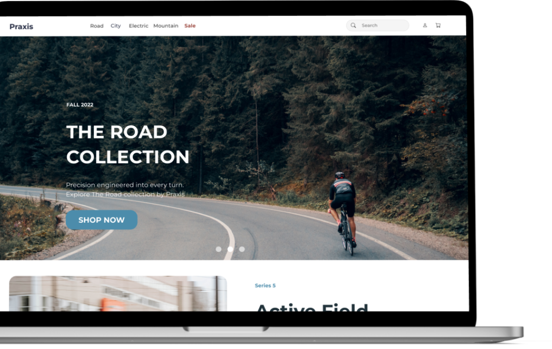
A call-to-action button directs the user, Jake, into the Road Bike section, while categories help him narrow down his search for the perfect commuter bike.
Because research confirmed the importance of the product comparison feature, I focused on designing with extreme clarity and visibility for the bikes’ most important product specs.
The Commuter bike was the ideal bike for most consumers, and highlighting it would be a key element to solving Jake’s main pain-point.
Explore the function of my prototype below
Final Prototype
Conclusion
Designing for cyclists challenged me to expand my scope.
As research data revealed cyclists are more selective than the average customer, I was able to use this UX project to learn the following lessons.
Find balance between conducting user research and relying on a company’s handed-off user data. I believe finding a balance between gathering user data firsthand and being handed user data by an organization is imperative for creating good designs that solve for real user issues in the future. In this case, primary research could have yielded different questions, as the user data provided was specific to keeping the organizational goal narrowly defined.
Less is more. Simplicity is strength. Designing the UI and writing my case study both required consistent revision to focus on what needed to be done, and then cut out all the extra. As the adage goes, less is more. Especially when you’re designing to solve a problem.
Possibilities for design are endless. The more I explored different competitors, the more I then expanded from traditional brands to technology company’s websites to car manufacturers and so on, finding inspiration far from where I began. As long as designs serve the primary user, I found a page can take a plethora of shapes and forms. In conclusion, there will always exist a world of growing possibilities for the future of digital space everywhere, and that falls within the role of the UX designers to discover and guide them.


